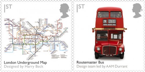
What I love about these is that the design of the "design stamps" is itself so beautiful, in the most understated way: clean white background and black and grey sans serif text and icon, nothing else visible except the subject of the stamps. I like to use the trick of making headline text black and supplementary or optional text grey myself, especially where for one reason or another only one size of type is wanted.
The other designs include Issigonis' Mini, Quant's mini, Concorde, the Spitfire, and Penguin books. Notwithstanding the presence of Beck's Underground map in the set, I think a stamp each could have been devoted to the Underground roundel and the font it uses, Edward Johnston's Railway type.
