Saturday, 29 March 2008

Bad statistics at the BBC

I read this BBC news article saying "The average UK person will this year have a greater income than their US counterpart for the first time since the 19th Century, figures suggest." Now this may be true, but I would point out that "GDP divided by population" is not the same as "The income of the average person". The first is the mean, the second is the median.

Where a distribution is highly right skewed, means and medians are far from the same. In the example I show on the right, the percentiles are as follows:
1% 19.0
2% 13.2
5% 7.0
10% 4.0
20% 2.2
50% 1.0
-
mean= 2.2

That is, the first percentile is nineteen times the median, the fifth percentile is seven times the median, and so on. This is just a made-up example (a power law, if you want to know) that I arranged so that the mean is conveniently the same as the twentieth percentile, i.e. only the upper twenty percent are making the "average" or more. But it's a feature of all right skewed distributions that the "average amount" isn't what the "average person" gets.

The "GDP per capita" is much more sensitive to changes in the income of the small population at the right of the distribution than the median is. It's possible for average people to be better or worse off if the GDP goes up, or better or worse off if it goes down.

That's why I'm never interested in hearing whether something is "helping" or "hurting" the country's Gross Domestic Product. The income of average people depends much more on the shape of the distribution than its total size.
Always show the distribution if you can

Someone said in response to a graph I posted in comments to a blog post, That's one of the reasons I find statistics so interesting because there's so many ways of showing the information.

That's why I think you should always show the whole distribution if you possibly can, as well as any averages you are presenting. You (or rather, your audience) never know what's hiding in the aggregate measure.

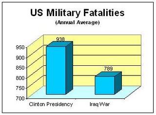
A recent example was this graph in a blog called "The Gateway Pundit":   


The graph shows that fewer soldiers died in a year in Clinton's first term than in a year in Bush's first term.

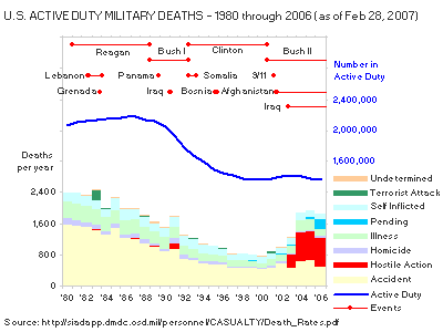
Well, that's sort of true, presented as an aggregate, but what does the data say if presented in its entirety? I got the numbers from (warning: PDF file) this Pentagon report and graphed them as follows:

This graph shows that
  • the fatalities reported in the first graph are all fatalities, including accidents
  • the numbers do not take into account the reduction in the size of the US military begun in George Bush's term in 1989, resulting in a much smaller military by 2001, hence fewer servicemen to have accidents
  • the specified "first term" includes the two years before the invasion of Iraq, and excludes the fatalities in 2005 and 2006.
The lessons from these two graphs are: 1) ask to see the distribution and not just the aggregates, and 2) context matters.

This is not even to mention the misleading and confusing three-dimensional column graph, and the use of a scale beginning at 700 for a column graph, which could have come out of a manual for how to distort numbers using graphics. But that's a subject for another day.

References:

http://gatewaypundit.blogspot.com/2006/10/us-lost-more-soldiers-annually-under.html

http://sayanythingblog.com/entry/active_duty_deaths_bush_vs_clinton/

http://scienceblogs.com/dispatches/2007/07/false_comparison_of_military_d.php

http://scienceblogs.com/authority/2007/07/lying_with_math.php