That's why I think you should always show the whole distribution if you possibly can, as well as any averages you are presenting. You (or rather, your audience) never know what's hiding in the aggregate measure.
A recent example was this graph in a blog called "The Gateway Pundit":
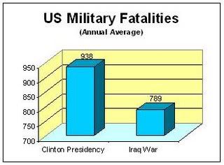
The graph shows that fewer soldiers died in a year in Clinton's first term than in a year in Bush's first term.
Well, that's sort of true, presented as an aggregate, but what does the data say if presented in its entirety? I got the numbers from (warning: PDF file) this Pentagon report and graphed them as follows:
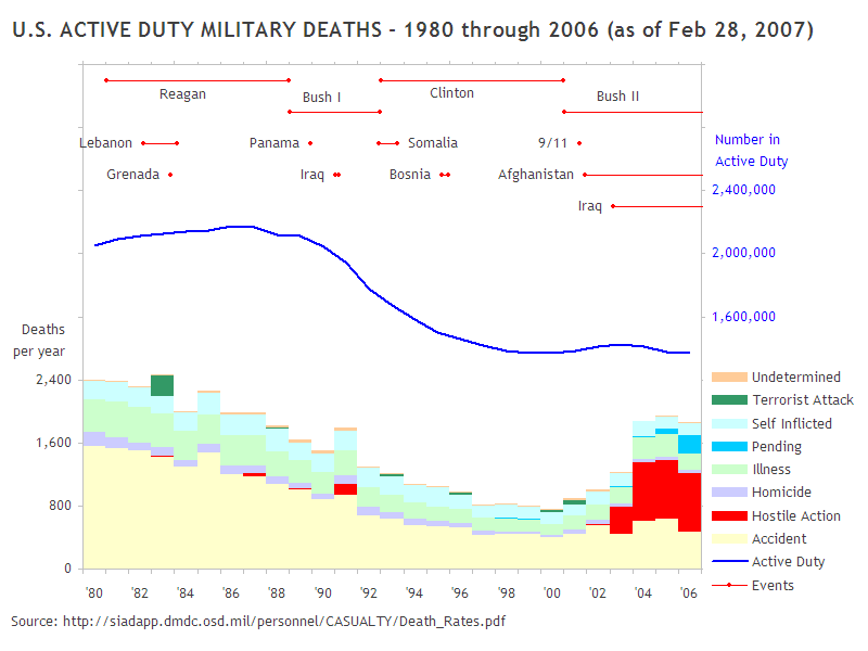
This graph shows that
- the fatalities reported in the first graph are all fatalities, including accidents
- the numbers do not take into account the reduction in the size of the US military begun in George Bush's term in 1989, resulting in a much smaller military by 2001, hence fewer servicemen to have accidents
- the specified "first term" includes the two years before the invasion of Iraq, and excludes the fatalities in 2005 and 2006.
This is not even to mention the misleading and confusing three-dimensional column graph, and the use of a scale beginning at 700 for a column graph, which could have come out of a manual for how to distort numbers using graphics. But that's a subject for another day.
References:
http://gatewaypundit.blogspot.com/2006/1
http://sayanythingblog.com/entry/active_
http://scienceblogs.com/dispatches/2007/0
http://scienceblogs.com/authority/2007/0
No comments:
Post a Comment