 Not very informative. So he tries it as a "petal chart"
 Still not showing much. The circular formats of radar and petal charts don't really add value in this case, since we expect to be able to sort best from worst, and we don't really care if the best comes round to meet the worst, like the worm Ouroboros chomping on its own tail.
Bertin says every graph is just a table really: this is the table in question:
 So why not just show it as a table?
 I've re-ordered the criteria and options to show a rough diagonal trend. The criteria are obviously re-orderable categories, and I assume the options are, even though they're numbered 1-4. I take it that's just anonymising. Clearly Option 1 is the package for you if performance and scalability are what you're looking for, while you should consider option 2 if you really care about usability and flexibility. Sometimes the options in the middle excel at some crieria in the middle, but in this case options 3 and 4 don't really have anything to offer against the all-round competence of option 1.
The spot matrix is a favourite of mine, and does appear in Semiologie graphique, but Bertin more frequently shows his tables as a stacked bar chart:
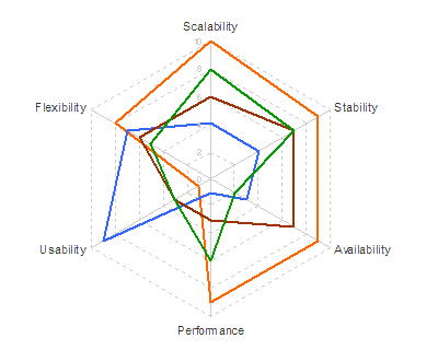
 Finally, has re-ordering helped the spider?
 Sadly, no.
4 comments:
Hi...
Thanks very much for providing better alternatives to the petal charts. I liked the one with circles better.
Thanks, Chandoo. I do too, because you can read it down as well as across.
I, too, like the spot matrix charts. In fact, I am pretty excited about them, because they might be perfect for a visualization that I need to do. Do you have any insights or advice on the best way to construct them in Excel? (and yes, I know that this is not an excel blog)
The key is to set up two bubble chart ranges: one creates bubbles of a constant size at each XY position in a rectangular area, then the second is made of white bubbles of variable size occupying the same spaces on top.
Check out this guide to a very similar related format at XLCubed. Their example overlays the bubble chart on spreadsheet cells to make the labels, while I make the labels using a third and fourth bubble range with invisible bubbles and custom data labels: the invisible bubbles are there purely to provide positioning for the labels.
Post a Comment