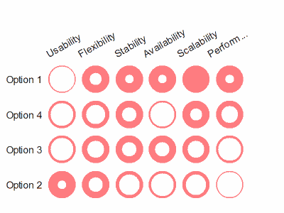
This is a great alternative, and would work really well in a dashboard. Five separate score levels is about the maximum that people can easily distinguish anyway. After that, you're relying more on the approximate response to levels of darkness to guide the eye. It becomes less of a table and more of a map.
Those curious about the history of such tables should have a look at page 174 of Edward Tufte's 1983 classic Visual Display of Quantitative Information, where Tufte shows and praises a Consumer Reports small multiple of tables of cars and their repair trouble spots by make and year. Tony Rose of DSA Insights points out that this is a sophisticated version of Harvey Balls, made less qualitative and more quantitative.
Edited to add: Thinking about the design of Chandoo's table some more, if you want to try his technique out in your own tables, bring the spots closer together, so that they appear to be words in a sentence. They'll be easier to read that way. And as there are only five columns in the example, if you bring them still closer, they can be like letters in a word, and "read" at a glance. Narrowing the table may require abbreviating the titles or turning them on their side, but I think it's worth it.

The design philosophy to follow is one similar to Tufte's "sparkline" philosophy, that a tiny picture is like a word, and should be presented at a similar typographical density. Stringing them out is liable to make it harder to see the patterns.
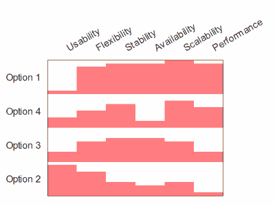
If you want to avoid privileging one orientation, you'll want the lines to be no further apart from each other than the spaces between columns. If you have only one row, consider abandoning spots altogether, and go for a tiny bar-graph sparkline instead. Gauging the relative value of circular spots is a problem, because you're asking the reader to judge areas, which are lower in Cleveland's Hierarchy than lengths. Their symmetry is only an advantage if the table is two-way, where columns would be harder to read up and down.
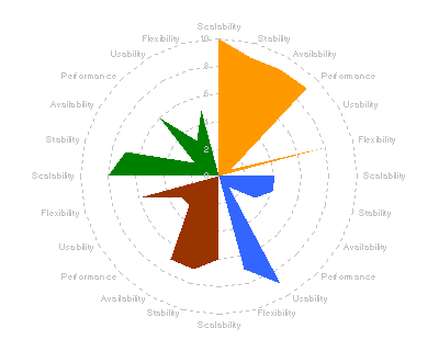
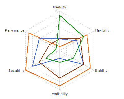
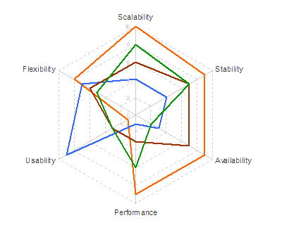 Not very informative. So he tries it as a "petal chart"