Thursday 27 November 2008

British design stamps


What I love about these is that the design of the "design stamps" is itself so beautiful, in the most understated way: clean white background and black and grey sans serif text and icon, nothing else visible except the subject of the stamps.  I like to use the trick of making headline text black and supplementary or optional text grey myself, especially where for one reason or another only one size of type is wanted. 

The other designs include Issigonis' Mini, Quant's mini, Concorde, the Spitfire, and Penguin books. Notwithstanding the presence of Beck's Underground map in the set, I think a stamp each could have been devoted to the Underground roundel and the font it uses, Edward Johnston's Railway type.

Wednesday 19 November 2008

Wednesday 22 October 2008

Using colour for preattentive processing in stacked bar graphs

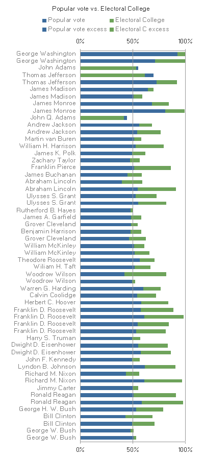
Earlier this month Robert Kosara at EagerEyes.org produced a visualisation of the difference, in historical US presidential elections, between the popular vote and the Electoral College vote, cast by the delegates that the state voters actually elect to vote on their behalf. The questions this visualisation might answer include:

Q1 How big were the popular and EC votes?
Q2 How big was the difference?
Q3 How often and when was the popular vote greater than the EC vote?
Q4 Was the EC vote over 50% (a "majority"-- only a "plurality", i.e. more than anyone else, is necessary to actually win)?
Q5 Was the popular vote over 50% (sometimes called a "mandate")?
Q6 Were they on opposite sides of the 50% line?

Robert used a stacked bar graph, in order to show the answer to some of these questions. I'll use my own version of his graph for consistency, but the colours are the original ones:

I found Q3 hard to compare across the years using Robert's graph, because detecting the difference meant seeing the change in position between the green and blue areas, and I had to do it consciously, instead of relying on preattentive processing to bring the few instances to my attention.

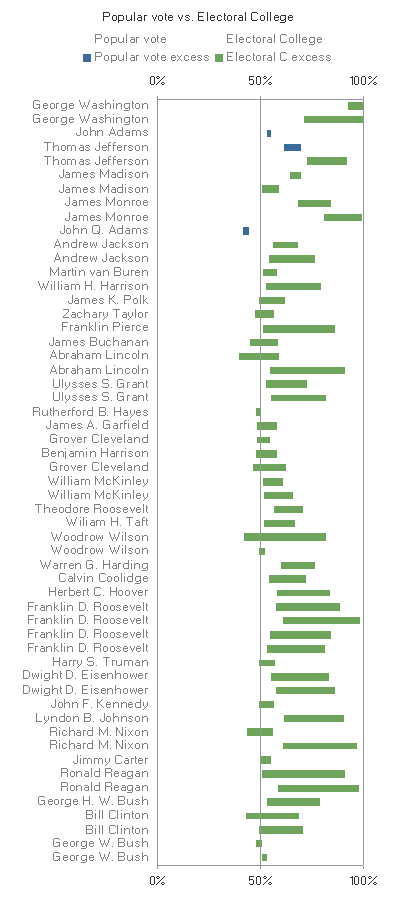
Kelly O'Day suggested dot plots, with or without lines, but I found the differences in Q2 hard to compare across the years, and still the switch rounds in Q3 hard to detect. It seemed to me that the blue and green bars were interfering with each other, and strictly speaking were redundant anyway, so in comments I suggested removing them to make a "floating bar" graph.

(In my original comment I changed the colours from blue and green to purple and teal, in an attempt to bring the hues round the colour circle toward the classic red-blue combination, without actually using red and blue, which for obvious reasons would be confusing in this political context. But I've decided the difference in hue discrimination wasn't dramatic enough to be worth the extra change)

Kelly liked it but said the scale didn't easily show the difference, which is true, but I was still trying to show the numbers in question Q1 as well as the difference in Q2. That purpose hadn't changed from the original bar graph, and I wouldn't want to just have a graph of the differences aligned along a common scale, because that would lose the Q1 information. I had only removed what I thought was duplicated information from the graph.

As a compromise, I present a re-colored stacked bar graph.

Now it's not floating any more, and there's no danger of interpreting it as a graph for differences only, but the eye is still drawn to the difference bars, and to the (three) instances where the popular vote is less than EC vote (Q3), and to the (seventeen) instances where the EC vote is a majority, but the popular vote isn't (Q6).

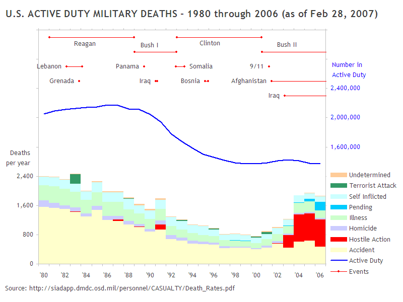
I've used this technique of more saturated colours to draw the eye, and lighter or less saturated ones to avoid distractions without removing information, in my blog post of a few months ago Always show the distribution if you can. There, I wanted to emphasise Pentagon-reported military fatalities attributed to terrorist attack (dark green) and hostile action (red), without concealing all the rest of the data. It's all there, nothing hidden, but it isn't overwhelming the eye.

Thursday 9 October 2008

Another Nobel Prize for visual intelligence!

When Al Gore was awarded the Nobel Peace Prize last year, robert Kosara at Eager Eyes called it "A Nobel Prize for Charts". Now the 2008 Nobel Prize in Chemistry has been awarded Osamu Shimomura, Martin Chalfie and Roger Tsien, for green fluorescent protein (GFP). I think that counts as another prize for graphical display of information:

Wednesday 8 October 2008

Using spots and rings in tables

jenmoocat in comments asks about the "spot matrix" table I used to display the scores from one to ten of X options in Y categories. My technique has always been about using bubble charts, in a similar way to this heatmap tutorial at More Information Per Pixel. Chandoo at Pointy Haired Dilbert describes a different way, using a table and the Wingdings 2 font.

This is a great alternative, and would work really well in a dashboard. Five separate score levels is about the maximum that people can easily distinguish anyway. After that, you're relying more on the approximate response to levels of darkness to guide the eye. It becomes less of a table and more of a map.

Those curious about the history of such tables should have a look at page 174 of Edward Tufte's 1983 classic Visual Display of Quantitative Information, where Tufte shows and praises a Consumer Reports small multiple of tables of cars and their repair trouble spots by make and year. Tony Rose of DSA Insights points out that this is a sophisticated version of Harvey Balls, made less qualitative and more quantitative.

Edited to add: Thinking about the design of Chandoo's table some more, if you want to try his technique out in your own tables, bring the spots closer together, so that they appear to be words in a sentence. They'll be easier to read that way. And as there are only five columns in the example, if you bring them still closer, they can be like letters in a word, and "read" at a glance. Narrowing the table may require abbreviating the titles or turning them on their side, but I think it's worth it.

The design philosophy to follow is one similar to Tufte's "sparkline" philosophy, that a tiny picture is like a word, and should be presented at a similar typographical density. Stringing them out is liable to make it harder to see the patterns.

If you want to avoid privileging one orientation, you'll want the lines to be no further apart from each other than the spaces between columns. If you have only one row, consider abandoning spots altogether, and go for a tiny bar-graph sparkline instead. Gauging the relative value of circular spots is a problem, because you're asking the reader to judge areas, which are lower in Cleveland's Hierarchy than lengths. Their symmetry is only an advantage if the table is two-way, where columns would be harder to read up and down.

Wednesday 24 September 2008

Reorderable tables II: Bertin versus the Spiders

Chandoo at Pointy Haired Dilbert has a post about the inadequacies of radar, or spider, charts; using a sample of four (software?) options to be selected, and six scores by various criteria, he presents them as a radar chart:
Not very informative. So he tries it as a "petal chart"
Still not showing much. The circular formats of radar and petal charts don't really add value in this case, since we expect to be able to sort best from worst, and we don't really care if the best comes round to meet the worst, like the worm Ouroboros chomping on its own tail.

Bertin says every graph is just a table really: this is the table in question:
So why not just show it as a table?
I've re-ordered the criteria and options to show a rough diagonal trend. The criteria are obviously re-orderable categories, and I assume the options are, even though they're numbered 1-4. I take it that's just anonymising. Clearly Option 1 is the package for you if performance and scalability are what you're looking for, while you should consider option 2 if you really care about usability and flexibility. Sometimes the options in the middle excel at some crieria in the middle, but in this case options 3 and 4 don't really have anything to offer against the all-round competence of option 1.

The spot matrix is a favourite of mine, and does appear in Semiologie graphique, but Bertin more frequently shows his tables as a stacked bar chart:
Finally, has re-ordering helped the spider?
Sadly, no.

Tuesday 23 September 2008

Giving in to data loss aversion

D. Kelly O'Day, of the Process Trends web site, has a new Charts & Graphs blog, and his first post comments on the US Census Bureau's Current Population Reports data discussed by Jorge Camoes, and Andreas Lipphardt at xlcubed.com, as an example of a confusing data set with too much detail, or is it just detail in need of sensitive presentation?


(as reader michael rightly points out in comments on the XLCubed post, this can't be showing the rise of income disparity, because it's percentage of households against fixed income level, not percentage of income against fixed household quantiles. Also, the series tops out at $100k, which is peanuts compared to the super-rich levels where the income transfer of the last few decades has really been most spectacular.)

Kelly abandons the time series approach to present the two end points in a dot plot:


However, I think that reducing the curves to a pair of points, one in 1967 and one in 2007, loses a lot of information that the full time series has to tell. So, in the spirit of defending loss aversion, I wondered if a readable time series graph could be constructed that would give real insights into the census table.

First, I made it a cumulative graph, so each income bracket now goes from zero to n(i), not n(i-1) to n(i). This means the lines can't cross any more, which should help:


I eliminated the >$100k line, as this is now by definition 100% of the households, cumulatively. As we see, the percentage of households making under $100k in constant dollars falls steadily from 1967 to 2005, which is just what we would expect from economic growth, and a desirable result. You want more people getting richer. However, this does not carry through to all income levels, which fall by less and less.

Perhaps this is an artifact of the linear scale, as written about by Jon Peltier and Nicolas Bissantz recently. So I tried it with a log scale instead:


(fully accepting Jon's comment that log scales do an equal injustice to the upper values, when the data is values equally distributed within an upper limit instead of proportionally distributed to infinity)

The surprising result is that the <$5k income level contains almost as many households in 2005 as in 1967, and significantly more than in the 70s, after a fall in the 60s. After a modest fall in the 90s, it rises again after 2000, as do all the other income levels below $100k. If we have said a fall is a good thing, then a rise must be bad. So the full time series data do contain a shocking insight, but it's to be found not at the upper levels but the lower ones, and not just by comparing 1967 to 2005, but following the trend down, then up. The dot plot can only tell a story of average improvement between 1967-2007, which masks a story of advance and retreat.

Thursday 4 September 2008

Reorderable Tables

I've been interested in the idea of reorderable tables since I read about Jacques Bertin coming up with the idea in his 1967 book Semiologie graphique. The idea is that if you don't have a preferred order for your rows and columns, why not order them so the values in the cells make a rough diagonal across the grid? This makes the patterns much more straightforward to detect.

But I didn't know how to implement it in a spreadsheet until I googled on the word "reorderable", which turns out to be used for Bertin's tables, and almost nothing else. Some of the hits describe something called the "barycenter heuristic", which is really quite simple. It's based on the idea that each row or column has a "centre of gravity" that you can calculate, and then sort by. Take for example this table from Juice Analytics review, 5 Options for Embedding Charts in a Web Page

I added formulae for calculating the barycentre of the rows and columns, of the following form:

=SUMPRODUCT(COLUMN(D5:F5),D5:F5)/SUM(D5:F5)
=SUMPRODUCT(ROW(D5:D9),D5:D9)/SUM(D5:D9)


Then, because Excel sort up/down is temperamental without well-defined headers, and left/right is even more so, I recorded macros like this:

Application.Goto Reference:="SORT_COLS"
Selection.Sort Key1:=Range("SORT_COLS"), Order1:=xlDescending, Header:=xlNo,
Orientation:=xlLeftToRight

Application.Goto Reference:="SORT_ROWS"
Selection.Sort Key1:=Range("SORT_ROWS"),
Order1:=xlAscending, Header:=xlNo,
Orientation:=xlTopToBottom


These use the pre-created named ranges SORT_ROWS and SORT_COLS shown in red and blue here:

Now when I run the two macros, the table sorts itself into this:

I linked the macros to the shorcut keys Ctrl-m and Ctrl-M, and depending on the structure of the data, they either converge quickly and stop responding to key presses, or sort the reverse of whatever they sorted the last time. This last behaviour is handy because it makes the table cycle though the four possible orientations. You may prefer the table in another orientation than the one it converges to initially.

This is a simple example, and could have been done by hand, but you can do it with more complicated tables too. This example is from the Junk Charts article Noisy subways:


It's not a perfect diagonal, and wouldn't be even if it was the optimal solution, and I'm not convinced this technique does find the optimal solution. But it's not bad for something so simple.

Friday 15 August 2008

Clock this

Jon Peltier has written about graphs based on hours of the day (and chosen the perfect title, so I have to make do with second best), with examples attempting to show the day and night cycles together intuitively.

I think the whole day-night split thing is artificial: there's no connection between the times that are twelve hours apart and happen to have the same number under our old mediƦval twelve hour day, twelve hour night scheme. I'm surprised how much less Americans use the 24 hour clock, and how they call it "military time" when they do. In Britain we associate it more with the coming of the railways in the nineteenth century, and the need for standard timetables (until trains made national time zones necessary, individual towns had their own time!) I've made a polar area graph on a 24 hour scheme here:
The polar area graph is one of my favourite neglected specialist graph types, but it really only has a chance of being the graph type of choice if

a) you don't mind reading stacked areas instead of position along a common scale (see Cleveland's Hierarchy),
b) the data set is truly cyclic, not linear, and
c) there are two series to compare, one much smaller than the other (here we lack a second, smaller series that could be plotted closer to the centre, to take advantage of the square root relationship between the area of the slices and their radius)

Saturday 12 July 2008

Sloppy step charts in the media

Major news organizations seem so slick, that it surprises me when they fall down on the simplest of graphical tasks. On 10 July MSNBC ran a story, How to value life? EPA devalues its estimate about the decline in the dollar value of one life used to weigh the cost of pollution prevention (if lives were even static in value, you'd expect them to rise with inflation).  The graph they showed was this one from the AP


I doubt that the value fell at a constant rate during certain periods, but that's what the chart seems to show, even though all graph drawing software has the means to represent the actual situation-- immediate drops on certain dates. Jon Peltier has written about this, in Line Chart vs. Step Chart.

The Wall Street Journal got it right with Clinton's Road to Second Place on 4 June:

Sunday 15 June 2008

Excel area chart with colour invert if negative

My intention is for this blog to be commentary on graphs and data, rather than instructions on drawing graphs using any particular program. But I can make an exception, and here's a technique I've worked out for making Area charts in Excel that change colour below the zero line. This is something that comes as a standard option in bar charts. consider the following table:


This makes a bar chart okay

But not such a good area chart

We can create a table that splits the positive and negative values


but the result is disappointing

The areas simply go to zero at the next value, which is not what we want. This happens even when the Excel Time-scale X axis type is selected by going to Chart..Chart Options..Axes and selecting "Time-scale". However, Time-scale has one feature that lets us easily fix the problem. Unlike the ordinary category axis, it does not present values in the same order as they appear in the table, but in strict time order. So if we make a new set of rows below our first set


where the formulae are (left to right, assuming the original table header started at cell A1)

=IF($A2*$A3>0,NA(),$A2)
=IF($A2*$A3>0,NA(),$B2+($B3-$B2)*$A2/($A2-$A3))
=IF($A2*$A3>0,NA(),0)


then the two areas should meet the zero line at the same interpolated date!

Remember, this only works if you've selected the "Time-scale" option in Chart Options. If you're looking for more Excel help, see the Jon Peltier and Andy Pope links on the right.

Saturday 10 May 2008

Multifunctioning graphical elements

This map from UNEP is a nice example of a graphic that needs no key, but they gave it one anyway.


(the map is the result of calculations intended to predict skin colour, not the actual skin colour of any real populations)

Saturday 29 March 2008

Bad statistics at the BBC

I read this BBC news article saying "The average UK person will this year have a greater income than their US counterpart for the first time since the 19th Century, figures suggest." Now this may be true, but I would point out that "GDP divided by population" is not the same as "The income of the average person". The first is the mean, the second is the median.

Where a distribution is highly right skewed, means and medians are far from the same. In the example I show on the right, the percentiles are as follows:
1% 19.0
2% 13.2
5% 7.0
10% 4.0
20% 2.2
50% 1.0
-
mean= 2.2

That is, the first percentile is nineteen times the median, the fifth percentile is seven times the median, and so on. This is just a made-up example (a power law, if you want to know) that I arranged so that the mean is conveniently the same as the twentieth percentile, i.e. only the upper twenty percent are making the "average" or more. But it's a feature of all right skewed distributions that the "average amount" isn't what the "average person" gets.

The "GDP per capita" is much more sensitive to changes in the income of the small population at the right of the distribution than the median is. It's possible for average people to be better or worse off if the GDP goes up, or better or worse off if it goes down.

That's why I'm never interested in hearing whether something is "helping" or "hurting" the country's Gross Domestic Product. The income of average people depends much more on the shape of the distribution than its total size.

Always show the distribution if you can

Someone said in response to a graph I posted in comments to a blog post, That's one of the reasons I find statistics so interesting because there's so many ways of showing the information.

That's why I think you should always show the whole distribution if you possibly can, as well as any averages you are presenting. You (or rather, your audience) never know what's hiding in the aggregate measure.

A recent example was this graph in a blog called "The Gateway Pundit":   


The graph shows that fewer soldiers died in a year in Clinton's first term than in a year in Bush's first term.

Well, that's sort of true, presented as an aggregate, but what does the data say if presented in its entirety? I got the numbers from (warning: PDF file) this Pentagon report and graphed them as follows:

This graph shows that
  • the fatalities reported in the first graph are all fatalities, including accidents
  • the numbers do not take into account the reduction in the size of the US military begun in George Bush's term in 1989, resulting in a much smaller military by 2001, hence fewer servicemen to have accidents
  • the specified "first term" includes the two years before the invasion of Iraq, and excludes the fatalities in 2005 and 2006.
The lessons from these two graphs are: 1) ask to see the distribution and not just the aggregates, and 2) context matters.

This is not even to mention the misleading and confusing three-dimensional column graph, and the use of a scale beginning at 700 for a column graph, which could have come out of a manual for how to distort numbers using graphics. But that's a subject for another day.

References:

http://gatewaypundit.blogspot.com/2006/10/us-lost-more-soldiers-annually-under.html

http://sayanythingblog.com/entry/active_duty_deaths_bush_vs_clinton/

http://scienceblogs.com/dispatches/2007/07/false_comparison_of_military_d.php

http://scienceblogs.com/authority/2007/07/lying_with_math.php